
Hello!
I just wanted to say thank you to everybody here at Diabetes.co.uk, as with your help and advice I've finally started to get a handle on my diabetes! 10 days ago I had an epiphany, and decided that it was high time I started taking care of my diabetes and learning how to look after myself - after 9 years of living in the dark, and in denial (diagnosed in 2000, at age 10).
I just thought I'd share something I made with you all:
This is a chart I made to help me visualise my results/diabetes activity with more ease.. I started making them the day I decided to take control..
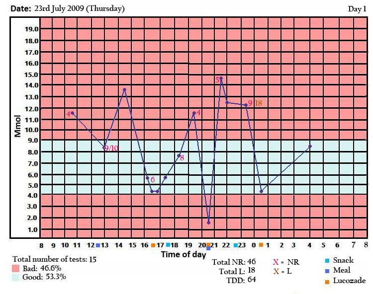
Day 1..
Day 8..
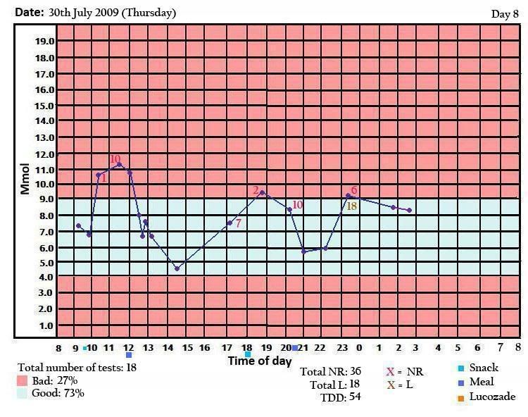
The chart should be pretty easy to figure out, but if not I'll tell you how to read them.. The times along the bottom is 24-hour, the numbers up the side are my Mmol/l readings. The pink numbers on the graph are amounts of Novo Rapid insulin injected, the brown numbers on the graph are amounts of Lantus insulin injected. The light blue squares are when I've had snacks, the dark blue squares are meals, and the orange squares are when I've taken Lucozade to correct a hypo (smaller squares indicate a small amount of lucozade).
Check out the difference in the results! I know Day 8 wasn't as perfect as it should be, but it's the best control I've ever had. Zero hypos and only a few high results (the highest being 11.3!).
Today's results have been a little more erratic, but I'm glad that I'm finally learning how to figure out insulin doses, etc!
I just wanted to say thanks to everybody, and keep up the bloomin' good work! Hope everybody is doing okay")
Robyn
xxx
I just wanted to say thank you to everybody here at Diabetes.co.uk, as with your help and advice I've finally started to get a handle on my diabetes! 10 days ago I had an epiphany, and decided that it was high time I started taking care of my diabetes and learning how to look after myself - after 9 years of living in the dark, and in denial (diagnosed in 2000, at age 10).
I just thought I'd share something I made with you all:
This is a chart I made to help me visualise my results/diabetes activity with more ease.. I started making them the day I decided to take control..
Day 1..
Day 8..
The chart should be pretty easy to figure out, but if not I'll tell you how to read them.. The times along the bottom is 24-hour, the numbers up the side are my Mmol/l readings. The pink numbers on the graph are amounts of Novo Rapid insulin injected, the brown numbers on the graph are amounts of Lantus insulin injected. The light blue squares are when I've had snacks, the dark blue squares are meals, and the orange squares are when I've taken Lucozade to correct a hypo (smaller squares indicate a small amount of lucozade).
Check out the difference in the results! I know Day 8 wasn't as perfect as it should be, but it's the best control I've ever had. Zero hypos and only a few high results (the highest being 11.3!).
Today's results have been a little more erratic, but I'm glad that I'm finally learning how to figure out insulin doses, etc!
I just wanted to say thanks to everybody, and keep up the bloomin' good work! Hope everybody is doing okay
Robyn
xxx
