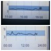
It's been quite interesting seeing the graphs on Facebook that others have posted.
You can see the difference between honeymooners and longer term t1s no longer producing insulin in the smoothness of the graph. I compare mine to someone who was diagnosed 6-8 months ago and mine is essentially a smooth line while there's has lots of minor peaks and troughs along the line, whilst the trend is driven by the additional insulin. You may be able to use the libre to determine, as a newly diagnosed diabetic, when your honeymoon is truly over!


