NoLongerACarbFiend
Member
- Messages
- 5
- Type of diabetes
- Type 2
- Treatment type
- Diet only
Hi, Google has not been my friend with regard to this, so wonder if anyone could help me interpret my libre graph, as it doesn’t seem to reflect my actual scan readings, although the general ups and downs following eating and exercise is following a line I’d expect.
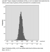
Right at the beginning of the graph there is a tail-off of a stress spike which reached 6.2 on scan and graph seemed to agree. Then after a very big lunch my reading was 7.8 but on the graph it looks more like high 6 (the upper limit is set at 7.8). Then at 6pm, just before dinner, I had a scan of 3.7 which again doesn’t show. Then after breakfast today I had a scan of 6 which isn’t showing, and has charted maybe 5.4. Its all got me a bit confused.
Also, is the saw-bone pattern on the graph ok? I’m used to the nice straight lines connecting the dots on the finger jab charts so all this variation is freaking me out a bit. I realise I’m holding my glucose between fairly tight parameters so I guess it doesn’t actually matter, but I somehow hadn’t expected minute by minute variations. I’ve only been using Libre for a few weeks and I’m self funding as I’m diet controlled. I do like the visibility it gives me, not just about what food does, but how I’m reacting to stress, insomnia and exercise, things I didn’t look at with only finger sticks. But at the same time I’m feeling a wee bit anxious about all the variation. I could ask the nurse but she’s already told me several times that all diet controlled T2s need is an annual HBA1C and that all testing does is increase anxiety.Any time in the past I’ve asked her to look at BG charts she’s basically just glanced, given a little smile and said ‘it’s fine’, so I’m not expecting any real help there. Thank you!


")