sigh, sorry we've been here before.
Ancel Keys had several degrees including a second post grad degree in physiology he from the Univ of Cambridge. He was not just a statistician. He did a large amount of laboratory research.
Re :The paper with the alleged cherry picked graph and the Seven Countries study.
Here is the paper that contains the graph dated. Note that it's dated 1952
http://www.epi.umn.edu/cvdepi/pdfs/Keys ... Health.pdf
It is one graph out of many in a long paper
Keys explains in the paper that this graph utilised data from
six countries that had comparable data to that available in the US. (some of the countries in the FAO data didn't even have death certification so were in no way comparable, others were only a year out of wartime occupation) You see the graph in context and decide.
I cannot find any paper by Lustig on this graph.
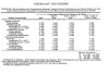
Here are the actual correlations using the 22 countries from normally quoted Yerushalmy and Hilleboe critical paper of 1957. There is an obvious correlation between the B26 category arthereosclerosis and degenerative heart disease and percentage of calories from fat when using all the 22 countries. It wasn't some fiction made up by Keys.
Y and H then added together the “death from arteriosclerotic and degenerative heart disease” with “other diseases of the heart,” and compared this with percentage of calories from fat. When they did this the correlation disappears.
However the fat category includes both animal and vegetable fat, if just animal fat and indeed animal protein are considered the correlations remain strong
There is a negative correlation across all categories between percentage of calories from vegetable fat and all forms of heart disease. There is also a negative correlation between all heart disease and percentage of calories from carbohydrates.
Interestingly the highest correlation is between total calories and B26.
If you take the correlations between fat and all cause mortality you will however find a negative correlation. Keys was however looking at heart disease.
There are also many other considerations which may influence the associations (wealth etc) some of which Keys discusses in his paper.
See Plant Positive
http://www.plantpositive.com/3-the-jour ... -taubes-3/
and Denise Minger
http://rawfoodsos.com/2011/12/22/the-tr ... -it-wrong/
Correlation doesn't infer causation but can form an hypothesis.
Which leads to the Seven countries study and much laboratory research.
The seven countries study did not start until 1958 and continued (s) for fifty more. Only 3 of the countries studied were in the contested graph. In each comparison country (to the US) cohorts were chosen to reflect more traditional ways of life and more industrialised. (16 cohorts)
http://www.sph.umn.edu/epi/history/overview/ The study was of it's time when formulated so naturally can be criticised but it doesn't make any sense to conflate it with the 6 countries graph described above and perpetuate an internet mythology
edited (I removed this and was going to post it separately because it really isn't on the original topic.
I agree with the original poster about carbs and de novolipogenesis and should have posted about that.
I restored it because someone else has now commented on my original