I agree, the old buttons were a lot more useful than the current ones. 'Agree', 'optimistic', 'hug', all clearer messages than the ones we have now.And a hug button too, I know they’re only buttons but they can convey a lot")
-
Guest - w'd love to know what you think about the forum! Take the 2025 Survey »
You are using an out of date browser. It may not display this or other websites correctly.
You should upgrade or use an alternative browser.
You should upgrade or use an alternative browser.
What’s happened to the forum?
- Thread starter lovinglife
- Start Date
lucylocket61
Expert
I only have the option of like or reply.Hi,
On the right hand side at the bottom bar..
Press and hold like and there are other optionsI only have the option of like or reply.
And an agree button!And a hug button too, I know they’re only buttons but they can convey a lot
Zhnyaka
Well-Known Member
- Messages
- 972
- Type of diabetes
- Type 1
- Treatment type
- Insulin
- Dislikes
- Homophobia, racism, sexism
how brave are your developers if they deploy such large-scale edits on Friday! Give them my respect. Haha, and a little sympathy, because they probably have to fix bugs all weekend 
- Messages
- 11,627
- Type of diabetes
- Type 2
- Treatment type
- Tablets (oral)
They are emojis, though. Not what we had previously. Also, when there are several in a post, visually uncomfortable to read.Press and hold like and there are other options
lucylocket61
Expert
There appears to be no diabetic type visible under names. It's hard enough when people don't fill in their profile or information, but this lack makes it harder. Why can't there be at least big red letters or something explaining why filling in profiles and diabetes information is helpful!
lucylocket61
Expert
In fact, there is now no way, when clicking on a posters name, to see any information about their diabetes anyway. Having to play 20 questions before offering suitable help is ridiculous. Yes, I am cross.
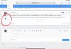
It seems that if you click the little arrow under the username, an expanded panel of options, including diabetes type comes up, but (at least on my tablet), the type is truncated! So I agree, that should be made more prominent. Pics attached.There appears to be no diabetic type visible under names. It's hard enough when people don't fill in their profile or information, but this lack makes it harder. Why can't there be at least big red letters or something explaining why filling in profiles and diabetes information is helpful!
And clicking on the profile name you then need to go to ‘about’ to get the information.
I guess some of this will be about getting used to where the information now is so a crib sheet or two wouldn’t go amiss.
Attachments
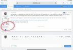
Yes...thanks @GoonergalIt seems that if you click the little arrow under the username, an expanded panel of options, including diabetes type comes up, but (at least on my tablet), the type is truncated! So I agree, that should be made more prominent. Pics attached.
And clicking on the profile name you then need to go to ‘about’ to get the information.
I guess some of this will be about getting used to where the information now is so a crib sheet or two wouldn’t go amiss.
I took a look using mobile.
Using portrait mode.
Clicked avatar once
Then once opened clicked again to check under "ABOUT".
Ok..just checked in landscape mode
All that info is under arrow under avatar.
But as you say shortened and no way to see clearly what type of medications, etc
A little teething issues as you say, until we all get used to where 'stuff' is
Last edited:
lucylocket61
Expert
There is no arrow under user names on my android, not in portrait or landscape view. Otherwise I would have tried clicking itIt seems that if you click the little arrow under the username, an expanded panel of options, including diabetes type comes up, but (at least on my tablet), the type is truncated! So I agree, that should be made more prominent. Pics attached.
And clicking on the profile name you then need to go to ‘about’ to get the information.
I guess some of this will be about getting used to where the information now is so a crib sheet or two wouldn’t go amiss.
Oldvatr
Expert
- Messages
- 8,453
- Type of diabetes
- Type 2
- Treatment type
- Tablets (oral)
Yes it starts well but ends roo early. On my large screen laptop the panel cannot be expanded and the user details are truncatedYes...thanks @Goonergal
I took a look using mobile.
Using portrait mode.
Clicked avatar once
Then once opened clicked again to check under "ABOUT".
Ok..just checked in landscape mode
All that info is under arrow under avatar.
But as you say shortened and no way to see clearly what type of medications, etc
A little teething issues as you say, until we all get used to where 'stuff' is
.
- Messages
- 6,386
- Type of diabetes
- Type 2
- Treatment type
- Diet only
I’m on my iPad on website view (don’t use the app) And I don’t have arrows under the names, if I click on the name it just gives me, counts for messages, reactions and points, then the ignore, follow, private message button
I’m on an iPad - desktop site, not app - and get the arrow. I’m using the UI.X layout.I’m on my iPad on website view (don’t use the app) And I don’t have arrows under the names, if I click on the name it just gives me, counts for messages, reactions and points, then the ignore, follow, private message button
Just tried going back to default layout and the arrow disappears so it seems the display is different dependent on which format you’re using.
- Messages
- 6,386
- Type of diabetes
- Type 2
- Treatment type
- Diet only
I was on default, I’ve just gone onto the UI.X layout and have the arrows but can’t cope with the layout, too pale and not enough definition for me - I’m sure it will all sort out as admin work on the upgradeI’m on an iPad - desktop site, not app - and get the arrow. I’m using the UI.X layout.
Daibell
Master
Same for me. No little arrow on my desktop.There is no arrow under user names on my android, not in portrait or landscape view. Otherwise I would have tried clicking it
lucylocket61
Expert
nor on my laptop . But even if I did, I still wont access information on any diabetic meds etc posters have shared in their profile, which makes safe advice and help harder and slower as I would have to ask questions and wait for responses.Same for me. No little arrow on my desktop.
